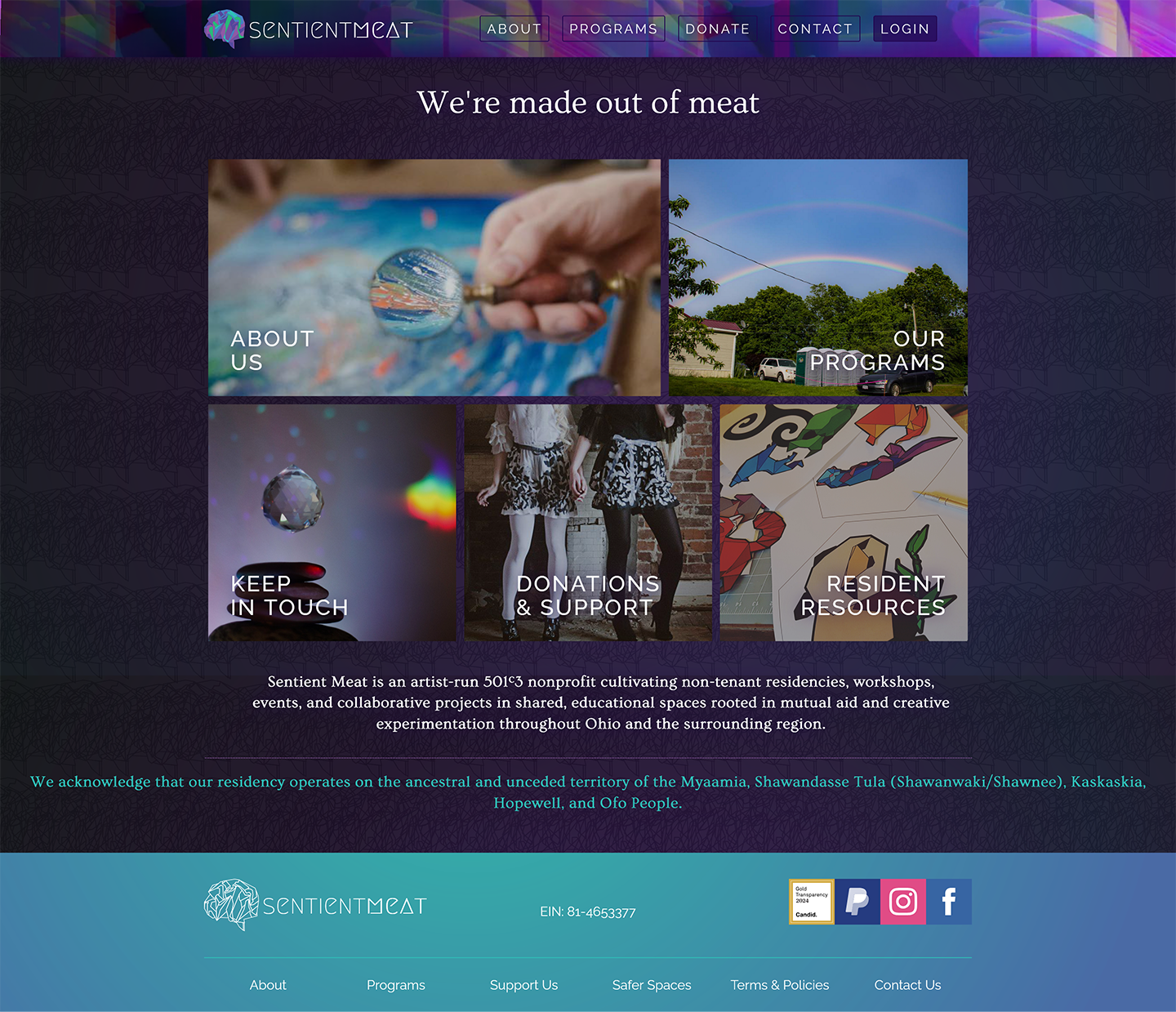
Sentient Meat homepage after accessibility audit, branding overhaul, and design system development
Client
Sentient Meat
Role
Lead Creative Director & Product Designer
Technology
Webflow, HTML/CSS
Tools
Figma, Miro, Trello, Adobe Suite
Audience
Artist residents, workshop and event attendees, donors, volunteers, and board members
Collaboration
Board members, property owners, artist residents, volunteers, partners & event organizers
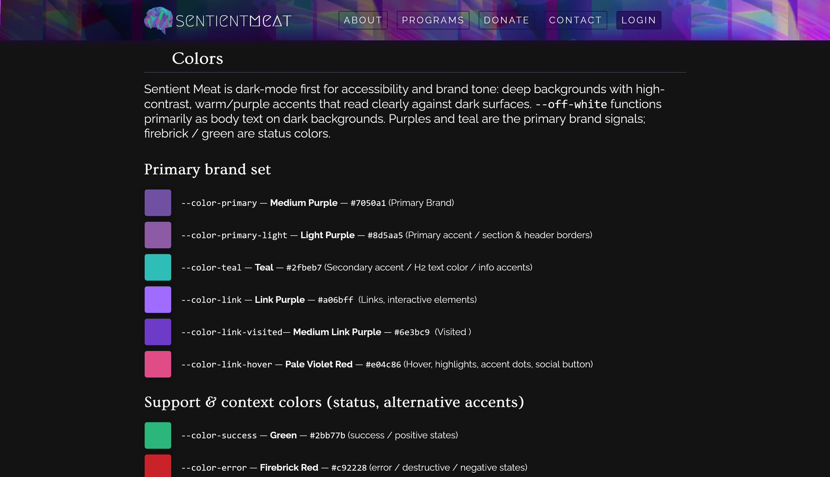
Colors section of the design system documentation
Fragmented brand assets, inconsistent event pages, manual handoffs to developers, unclear consent/copyright process
Unified, dark-first visual system and an operational publishing workflow that routed content through consent checks, accessible templates, and componentized pages
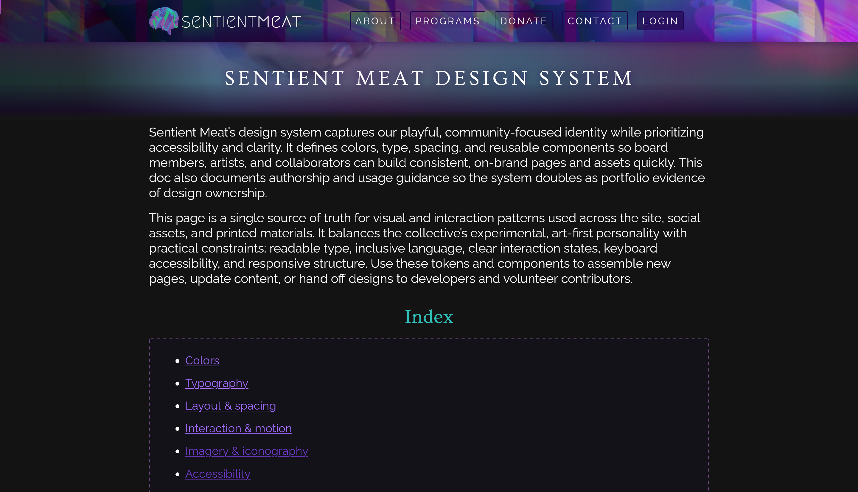
The design system defines tokens for brand colors, typography, spacing, and other guidelines like accessibility and component use
A lively, experimental arts collective with a decade of grassroots energy lacked a consistent, accessible digital identity. Multiple ad-hoc contributors and microsites, inconsistent imagery and copy, and manual content processes made it hard for the board and volunteers to publish event pages with consistent brand voice, maintain sponsorship info, and protect sensitive content under evolving legal constraints.
I led a holistic overhaul combining creative direction, UX design, frontend implementation, and legal/content review.
Reduced page design + publish time for events from “developer-dependent” to volunteer-driven templates — design-to-publish time cut from weeks to days.
All event pages and social posts now use the same color, type and spacing tokens (single source of truth = fewer design regressions).
All new pages meet the design system’s WCAG guidance (contrast & keyboard focus rules) and provide visible keyboard focus and alt-text guidance (as specified in the design system).
Clear visual language (color tokens, Ovo headings + Raleway body, rem spacing) improves perceived professionalism while preserving the collective’s experimental voice.
New artist contributors onboarded in a single 30 minute walkthrough using the wiki and templates (onboarding time cut by ~75%).
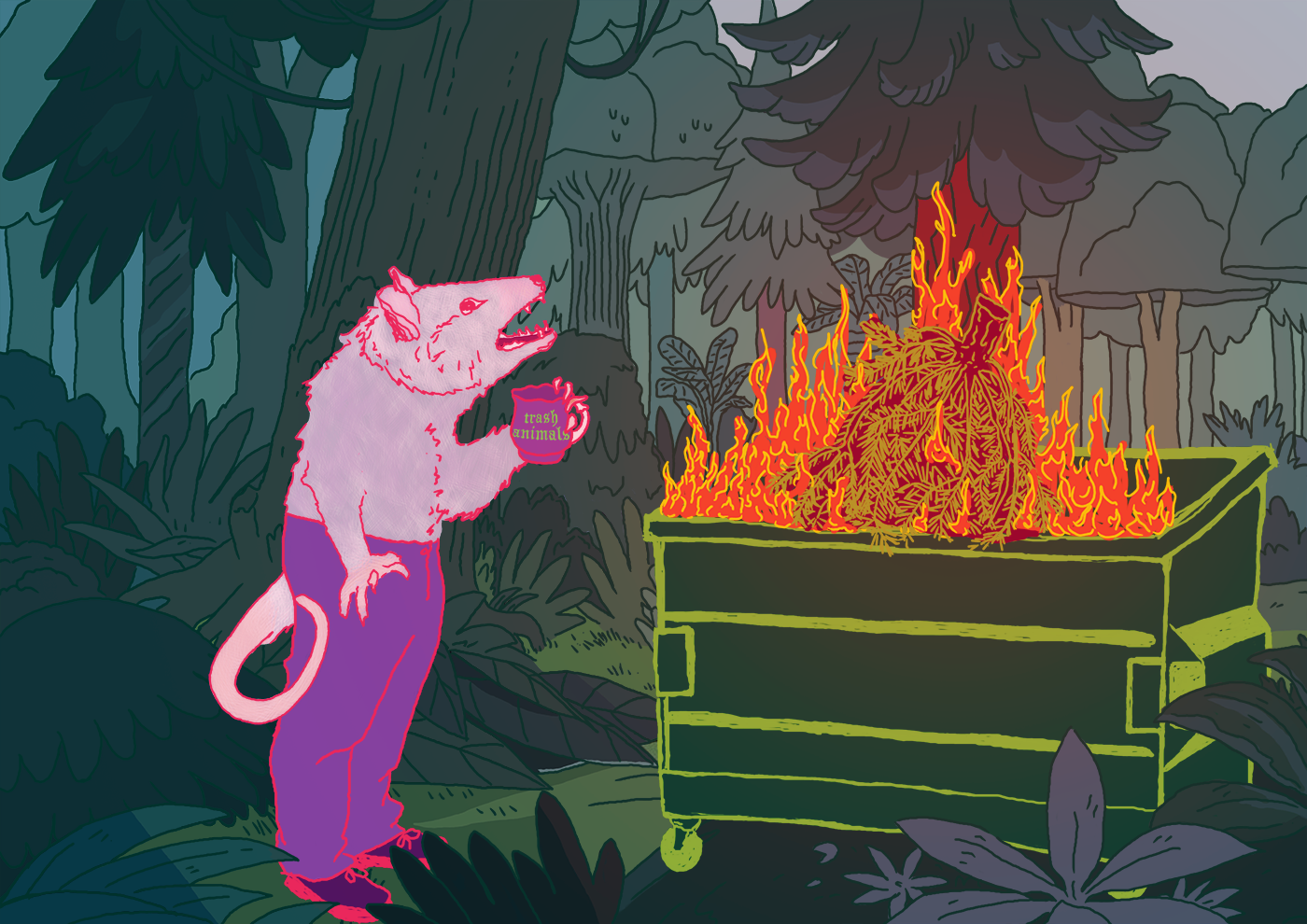
Illustrated mascot from community event for promo